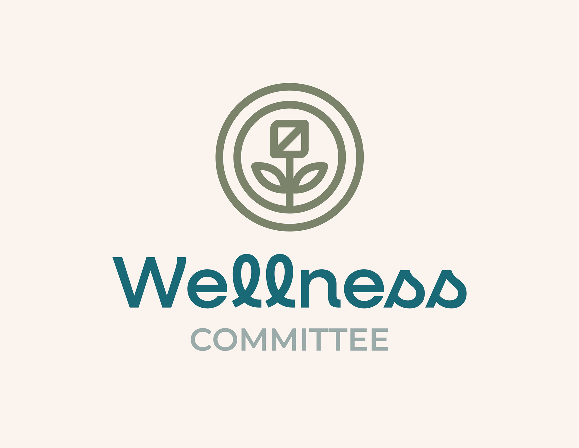
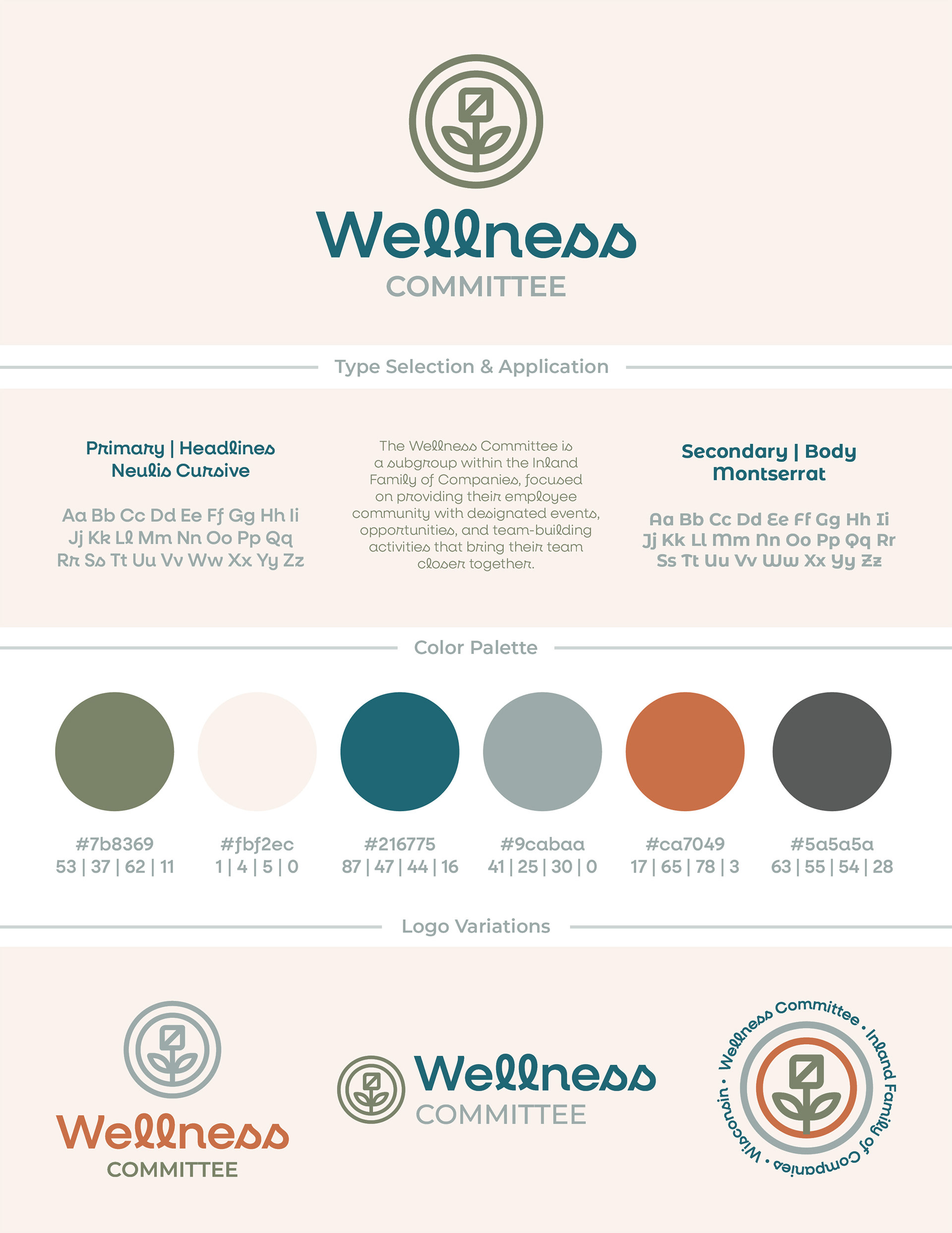
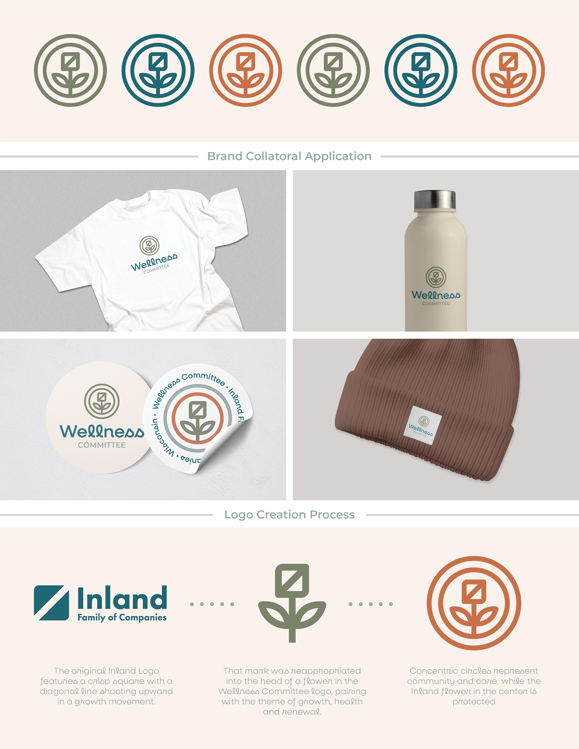
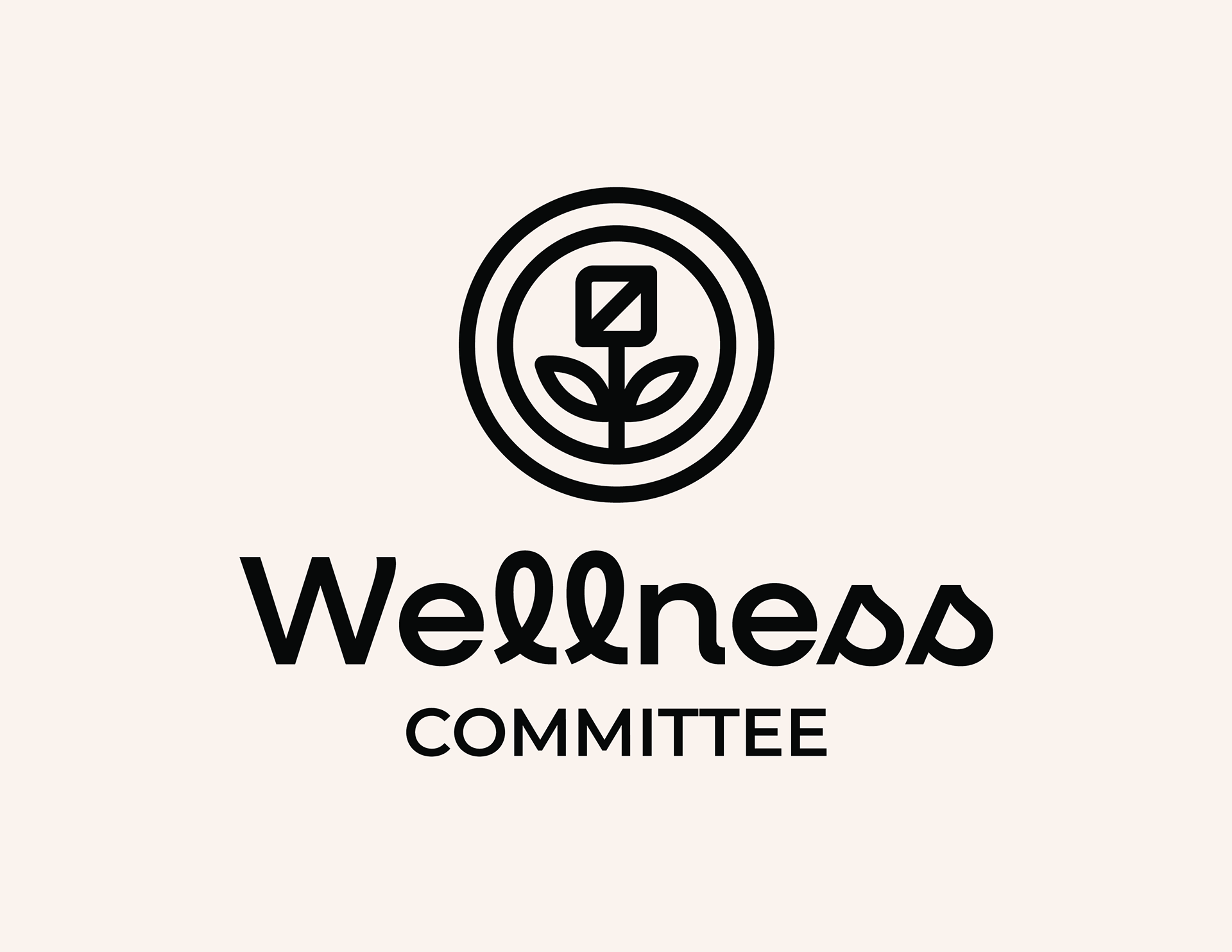
I was tasked with creating a brand identity for a company’s internal subgroup, called The Wellness Committee, that was focused on providing their employee community with events, opportunities, and team-building activities that promoted company culture and unity.
Working off the company’s main existing logo, I created a new logo and branding system that would mesh well with the corporate feel of the parent brand, but still exist on its own as a health and wellness group.
The original company logo, which I helped to update as part of another design project, features a crisp square with a diagonal line shooting upward in a growth movement. This mark was reappropriated into the head of a flower in the new Wellness Committee logo, pairing with the theme of growth, health and renewal. Concentric circles represent community & care, while the Inland flower in the center is protected.